
Introduction
Ever wonder why some websites feel effortlessly polished while yours looks “off” but you can’t pinpoint why? The secret isn’t complex coding—it’s mastering subtle design principles. In this guide, web designer Matt Jumper shares 7 easy tweaks to elevate your site’s aesthetics, readability, and user experience. Whether you’re building an e-commerce store, portfolio, or blog, these tips work for any platform (Figma, Webflow, or WordPress). Let’s fix that “almost there” feeling!
1. Optimize Space: Stop Wasting Screen Real Estate
A common mistake? Splitting layouts 50/50. Example: A product page with an image on the left and text on the right.
Problem:
- Text stretches too wide, causing eye strain.
- Buttons/selectors take unnecessary space.
Fix:
- Use a 9:3 column ratio (image: 9 columns, text: 3).
- Place elements like quantity selectors beside buttons instead of stacking them.
Result: Cleaner layouts that guide users naturally.
2. Adjust Letter Spacing for Readability
Fonts often need fine-tuning.
Rules of Thumb:
- Tighten headlines (-2% to -4% letter spacing) for bold impact.
- Loosen uppercase text (+2%) for readability.
Example: A 44px headline with loose spacing feels weak. Reduce spacing by 4% to make it authoritative.
3. Fix Line Heights to Avoid Crowded Text
Poor line spacing ruins readability.
Ideal Settings:
- Headlines: 100–110% line height.
- Body text: 140–160% line height.
Before: A 16px paragraph at 100% line height feels cramped.
After: Bump it to 140% for breathing room.
4. Use the 8px Grid System for Balanced Layouts
Design chaos starts with random spacing.
How It Works:
- Use multiples of 8 for margins, padding, and font sizes (8, 16, 24, 32…).
- Avoid odd numbers (e.g., 5px, 13px) for consistency.
Pro Tip: Set Figma/Webflow grids to 8px increments.
5. Apply the Golden Ratio to Font Sizes
Struggling with font hierarchy? Let math help.
Formula:
- Multiply body font size by 1.5–2x for headlines.
- Example: 16px body × 2 = 32px headline.
Why It Works: Creates visual harmony between text elements.
6. Swap Pure Grays for Tints & Shades
Pure grays clash with colored backgrounds.
Fix:
- Tints: Mix your background color with white (e.g., beige + white).
- Shades: Add black at low opacity (e.g., 8% for dividers).
Result: Cohesive colors that adapt to any palette.
7. Match Icon Weights to Your Typography
Mismatched icons scream “amateur.”
Quick Wins:
- Thin icons (1px strokes) pair with light fonts.
- Bold icons (2px strokes) match medium/bold fonts.
- Customize: Use 1.5px strokes if needed.
Before: Light icons with bold text = disjointed.
After: Adjusted icons unify the design.
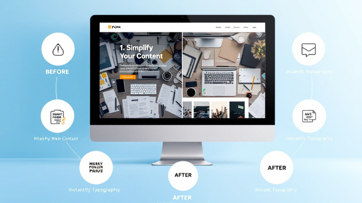
8. Before & After: See the Transformation
Caption: The same e-commerce template before (cluttered, uneven) and after (balanced, professional) applying these tips.
9. Frequently Asked Questions
Q: Do these tips work for mobile design?
A: Yes! Use smaller 8px increments (e.g., 8px → 4px) for mobile screens.
Q: What tools do I need?
A: Free tools like Figma or Canva work. For code, try Webflow or WordPress. You can read this post for 10 Game-Changing AI Tools Every Content Creator Needs in 2025
Q: How do I practice these skills?
A: Redesign your favorite sites using these rules.